The task
Design a landing page where a parent understands in a couple of minutes what and how their child will learn, what it costs, and books a free trial lesson.
What got in the way
There are many online schools for kids and they look alike: bright pictures and promises. Parents can't tell what makes a school different, and teenagers aged 12-16 find childish design unserious.
Project constraints
- No childish design: half the students are teenagers, the only childlike touch is the owl mascot
- The parent pays and the child learns - copy for both, polite address to the parent
- Subscriptions and instalments shown honestly, without small print
What we built
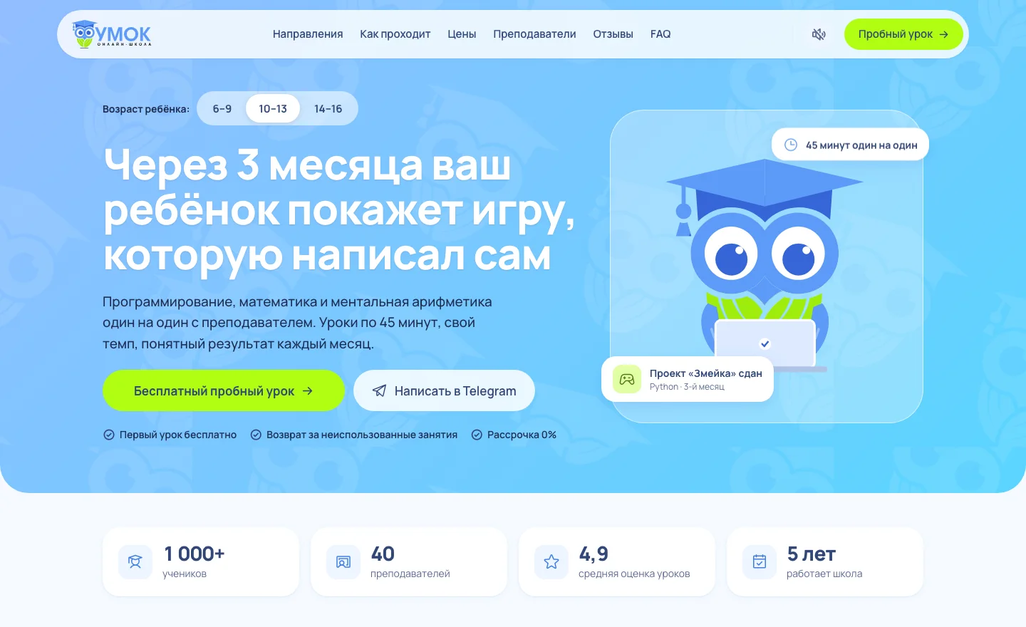
- Own design system: blue and lime, Manrope type, an owl mascot with emotions that follows the cursor
- Hero with an age switch: headline, example and the owl's pose change for 6-9, 10-13 and 14-16
- «Find a course in 3 questions» quiz with a course recommendation
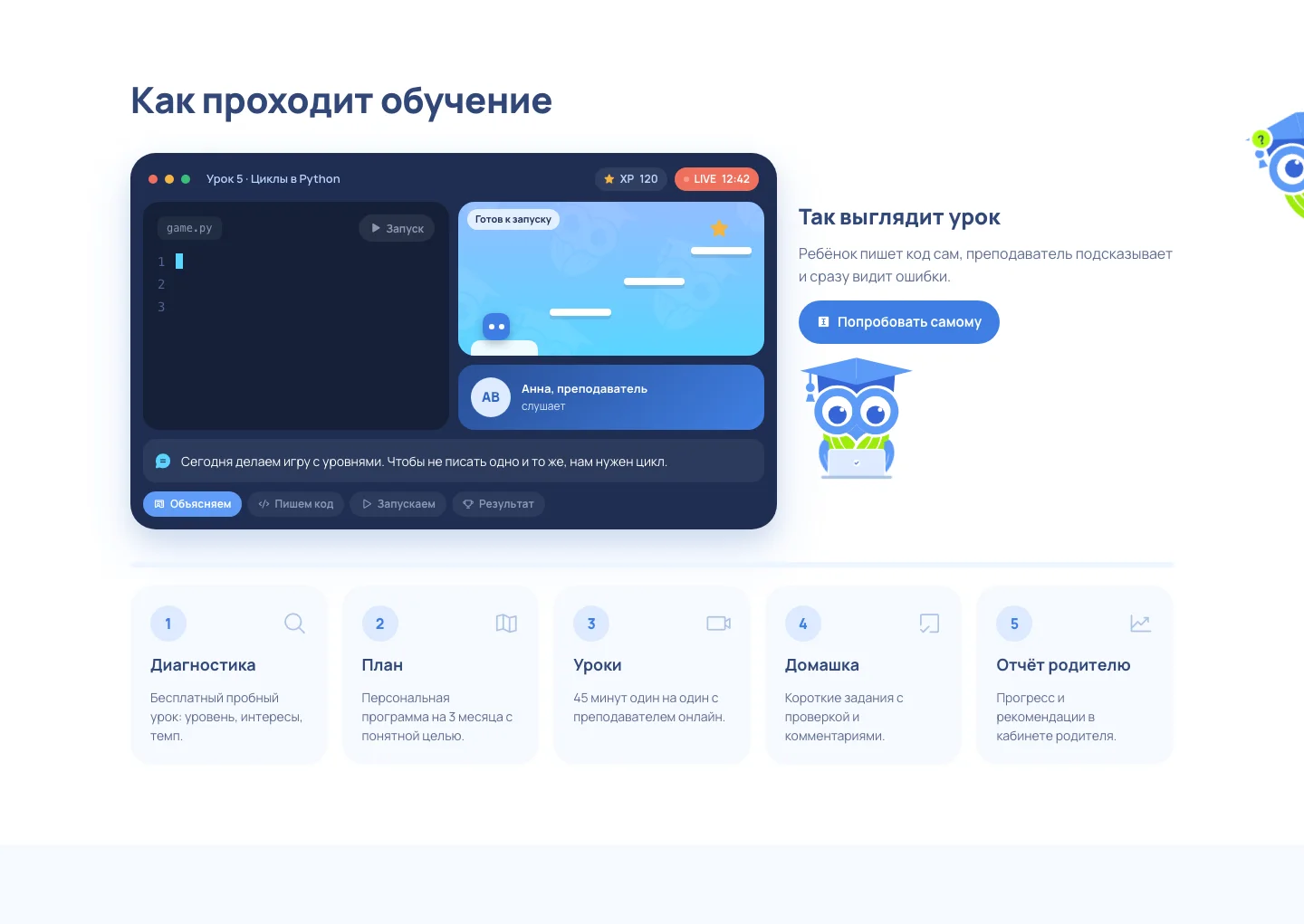
- Live lesson scene: code is typed and run, the hero clears a level, and a visitor can type their own text
- Subscription prices with a «hit» badge, old price and instalments, flip cards for teachers
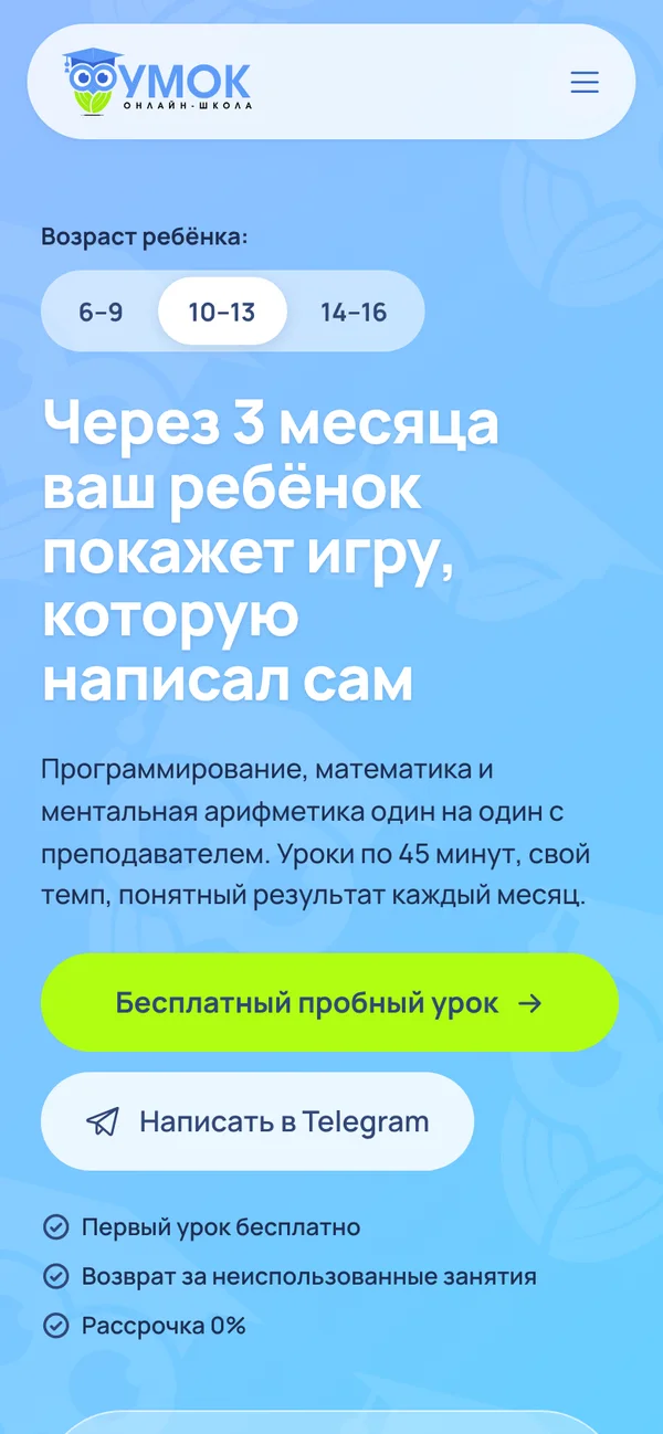
- Chat assistant, FAQ, trial lesson form and mobile version
How it looks

Similar project
If you need something similar, the service page lists what is included, timelines and pricing.